Rebuilding the Foundation: 0→1 Design System for Legacy B2B Platform

Overview:
Legal Genius is an AI-powered legal research and drafting platform designed to help legal professionals analyze case law, generate structured drafts, and streamline complex workflows.
As the product scaled, the legacy system accumulated technical constraints and UI inconsistencies that limited growth. Instead of patching these issues, we rebuilt the platform in a new environment and anchored it with a foundational design system to ensure consistency, trust, and long-term scalability.
My Role:
As a founding designer, I created a scalable design system that eliminated legacy UI inconsistencies, streamlined design-to-development handoff, and accelerated feature delivery across the rebuilt platform
Timeline:
3 months
Team:
Product manager
Developer
Product designer (me)
Skills:
Design Audit,
Design Principles,
Dev-Handoff,
Conversational AI Patterns
The Strategic Decision: Why We Didn’t Migrate the Old Platform
The legacy system had:
-
Deep engineering dependencies that increased risk during changes
-
Inconsistent UI patterns across workflows
-
Hard-coded visual styles with no reusable logic
-
Accumulated design debt from years of patchwork updates
Migrating the old interface would have carried those inconsistencies into the new environment. Rather than migrate those problems forward, we made a strategic decision to start fresh.

1. Layout & Card Bloat:
Redundant nesting (cards inside cards) created "Inception-style" borders that wasted 15% of screen real estate.

2. Form Layouts:
Modals like "Edit Case," input fields were stretched to 100% width. This disconnected the labels from the inputs, making it difficult for users to scan and complete forms quickly.


3. Missing Button States
Every interactive element used the same brand color. This created significant visual clutter, leaving users confused about which action to take first.


4. Contrast & Legibility
The platform lacked a defined color and type standard, resulting in several low-contrast elements that failed to meet WCAG 2.1 AA standards. This made the platform difficult to navigate for users with visual impairments or those working in high-glare environments.
Designing for Legal AI: Constraints
Legal research and drafting tools are not lightweight SaaS dashboards.
They require:
-
Dense information presentation
-
Long-form reading and citation review
-
High trust and authority in visual tone
-
AI-generated drafting that must feel precise, not experimental
Clarity, hierarchy, and trust were non-negotiable.
This context shaped every system decision.


Setting Design Principles
1. Clarity Over Decoration
Legal workflows demand precision. Visual styling should support comprehension, not compete with content.
2. Build for Density, Design for Breathability
Research interfaces are inherently information-heavy. Structured spacing and hierarchy prevent cognitive overload.
3. Trust Is a Design Constraint
AI-generated content must feel reliable and transparent. Interaction states and citation visibility reinforce credibility.
4. Design for Variability
AI outputs are unpredictable. The system was built to accommodate dynamic content without breaking structure.
Learning from the Best Before Getting Started
To ensure the new system was strong, I researched industry leaders like IBM Carbon, Shopify, Polaris, Arco, etc., to understand how they handle high-density data.


Establishing the Foundations
Before building components, I defined the core visual language that would govern the entire platform.
1. Spacing System
The legacy interface suffered from inconsistent spacing that made screens feel cluttered and unpredictable.
I introduced a structured spacing scale based on an 8 pt grid system.
This created:
-
Predictable layout rhythm
-
Cleaner alignment across dense research screens
-
Reduced arbitrary spacing decisions during feature development
By defining spacing tokens early, we prevented entropy as the product scaled.

2. Typography System
Legal workflows involve scanning case law, reviewing citations, and drafting precise language. Typography needed to support long-form reading without overwhelming the user.
I defined:
-
Clear hierarchical levels (headings, subheadings, body, captions)
-
Balanced density for information-heavy layouts
-
Structured differentiation between AI responses and legal text
The goal was not aesthetic minimalism — it was cognitive clarity.

3. Color System & Brand Evolution
One of the most strategic changes was evolving the brand color.
The original platform used purple, a tone commonly associated with generic AI and SaaS products. While modern, it did not reflect the authority and trust required in legal environments.
We shifted to a golden yellow primary brand color.
Why:
-
Gold conveys authority, credibility, and heritage
-
It aligns more closely with legal symbolism and institutional trust
-
It differentiated the product from typical AI competitors

Before

After
Beyond brand color, I established semantic color tokens:
-
Primary
-
Success
-
Warning
-
Error
-
Neutral
This ensured scalability for future theming and feature expansion.


4. Elevation & Shadows
In dense research workflows, depth must guide attention, not decorate.
I defined a restrained elevation system that:
-
Clarified hierarchy between panels
-
Reduced visual noise
-
Maintained a professional tone
Subtlety was intentional.


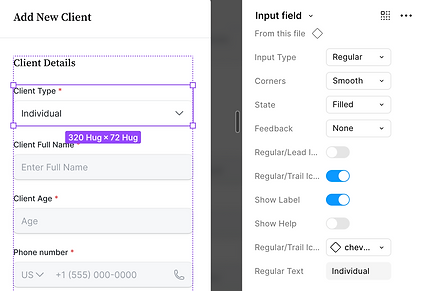
Building the Component Architecture Alongside Product Redesign
As we redesigned research, drafting, and AI interaction experiences, I extracted repeatable patterns into scalable components.
Core components included:
-
Button system (primary, secondary, destructive, ghost)
-
Form inputs with structured validation states
-
Search and filtering modules
-
Data tables optimized for legal case comparison
-
AI response containers
-
Modal and side-panel systems
-
Structured empty states
Each component included:
-
Defined states (hover, focus, disabled, loading)
-
Variant logic
-
Usage rules
Building components inside real workflows ensured the system was grounded in practical constraints, not abstract guidelines.


Integrating AI Into the Design System
Because the platform centered on AI-powered legal research and drafting, the design system needed to accommodate dynamic and unpredictable content.
Key considerations included:
-
Clear visual distinction between user-authored and AI-generated content
-
Loading and regeneration states to handle asynchronous AI processing
-
Structured citation display to reinforce credibility
-
Scalable containers that maintained readability across short and long outputs
In a legal context, AI must feel reliable and authoritative. The system emphasized clarity, restraint, and transparency to ensure that AI outputs enhanced workflows rather than undermined trust.


Preventing Design Debt From Day One
Legacy systems often degrade because foundations are not defined early.
By introducing:
-
Consistent spacing tokens
-
Structured typography hierarchy
-
Semantic color logic
-
Reusable component architecture
We avoided rework as new features were introduced.
The system became a velocity enabler, not a bottleneck.
It reduced:
-
Inconsistent UI decisions
-
Redundant component creation
-
Alignment gaps between design and engineering


Before → After
The original platform exhibited:
-
Inconsistent button styles
-
Visual clutter in research tables
-
Weak hierarchy in drafting interfaces
-
A generic SaaS aesthetic misaligned with legal authority
The rebuilt platform introduced:
-
Structured hierarchy across dense information
-
Unified component logic
-
Cohesive brand identity
-
Stronger trust perception
Home


Drafts


Case Details


Tooling & Structure
The system was organized in Figma using:
-
A centralized component library
-
Clear naming conventions
-
Variant-based components
-
Structured file organization for scalability
The goal was to create clarity not just in UI, but in collaboration.

Impact
As a founding designer, this work allowed the new platform to launch without inheriting legacy UI debt.
Product
-
Launched new platform without inheriting legacy UI debt
-
Standardized UI across core research and drafting workflows
-
Created a scalable foundation for future feature expansion
Engineering
-
Reduced UI inconsistencies during implementation
-
Established shared component logic between design and development
-
Enabled faster iteration through reusable component structure
Operational
-
Prevented redundant component creation
-
Reduced ambiguity in design decisions
-
Centralized visual standards in a single system
Brand
-
Repositioned visual identity from generic AI SaaS to legal-aligned authority
-
Improved trust perception through cohesive system design
Reflection
🌱 When rebuilding a platform, the design system should anchor the product, not follow it. Defining foundations early prevented design debt from re-entering the new environment.
🌱 Establishing spacing, typography, color, and component logic upfront created consistency across workflows from day one.
🌱 Embedding system thinking into real product redesign enabled faster iteration and reduced ambiguity between design and engineering.
🌱 Aligning the visual identity with the legal domain strengthened product credibility during relaunch.